The Challenge
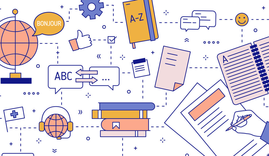
SDL specialises in language translation software and services. Our challenge was to completely transform their digital experience, improving the overall user experience of the site and creating a stronger brand identity.
The Process
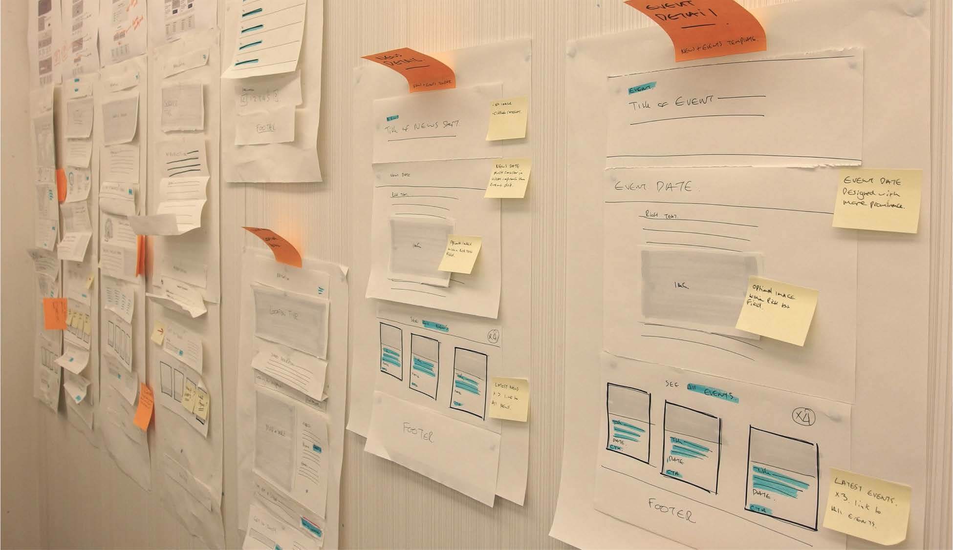
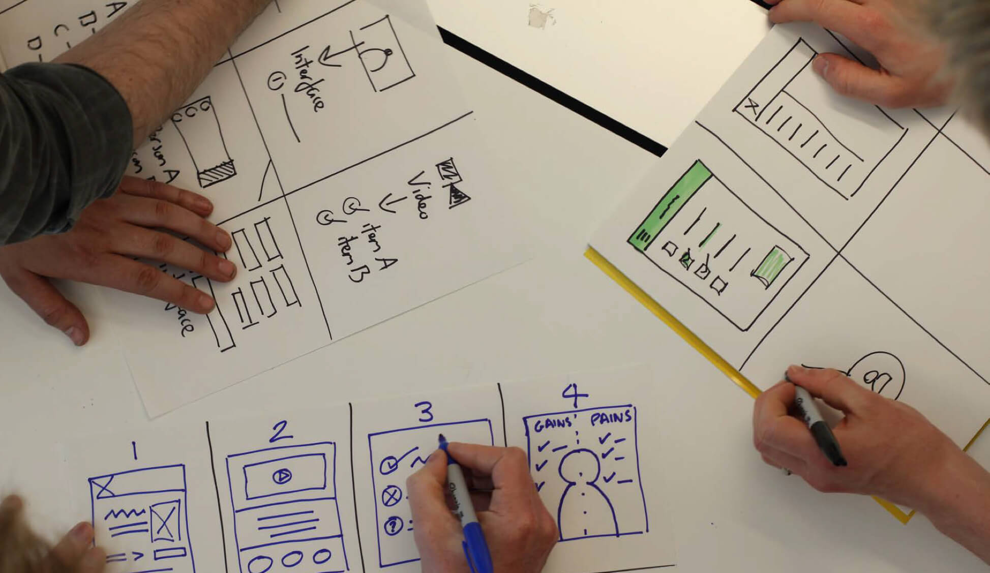
The project was kicked of with a discovery phase. The purpose of this phase is to understand the user needs and requirements and also the business goals. Once this was complete, we moved into the define phase. Starting with wireframes, we began to model page templates and component structure. During this phase, I worked closely with a front end developer and PM to ensure that our ideas were possible and within budget.
Accessibility Evaluation
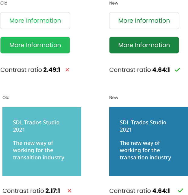
One of my first steps was to assess the accessibility of the site, and I quickly found that there were a lot of issues with font sizes, colours and contrast. These are all vital to accessibility, so my first job was to ensure that everything we did from there-in was fully WCAG compliant.
Defining the Styleguide
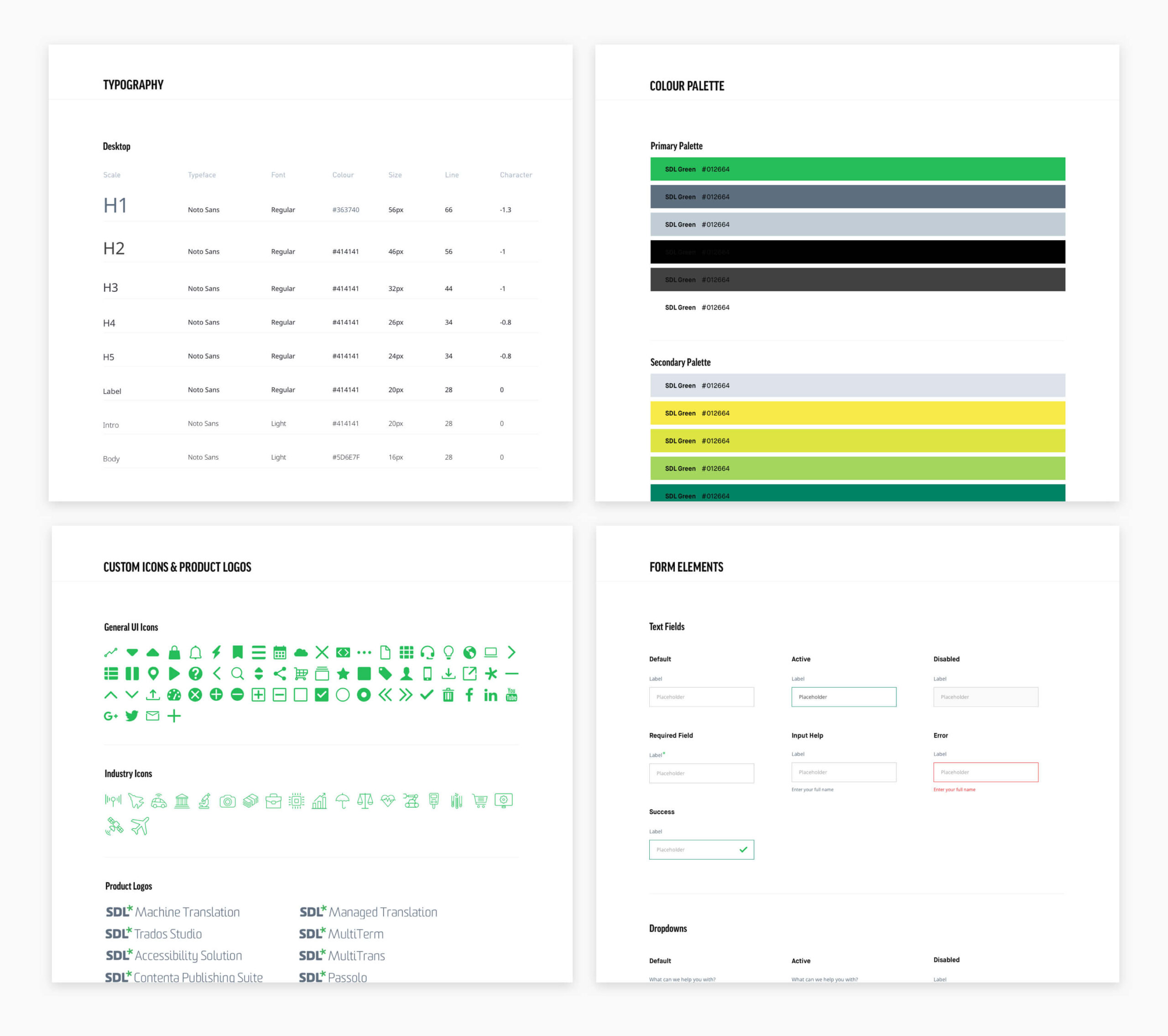
A styleguide is a must for all complex, user facing digital products. It gives designers, developers and content owners a single source of truth, which achieves a greater amount of consistency throughout the product. The client wanted a complete refresh, so it was good to have some creative freedom with this. Working alongside a junior designer, we created a new visual direction for the client which would form the basis of all the components and page templates.
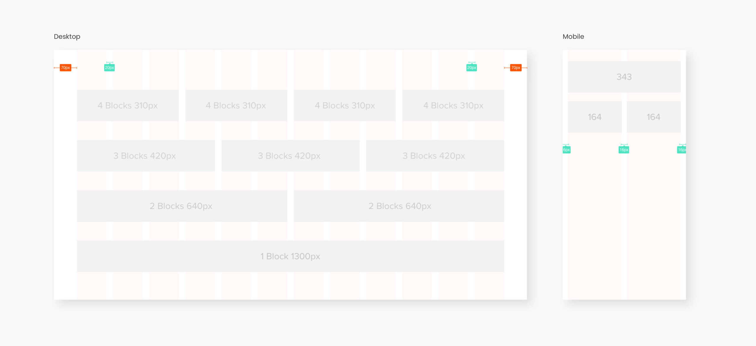
Responsive Grid
Before making a start on designing any components, i set up a respsonsive grid system. Personally I use a 12 column grid on desktop and a 2 column grid on mobile. There are lots of benefits to using a well designed grid system;
- Clarity: Grids bring order to a layout making it easier for users to find and navigate through information.
- Collaboration: Grids make it easier for other designers to work and collaborate on the design, as they provide structure and a guide as to where elements should be placed.
- Consistency: Grids create consistency in the layout of components across the site, creating a structural harmony in the design.
- Organisation: Grids allows you to create a set structure to align elements against. This allows you to create a clean and consistent organised layout.
8 Point Grid System
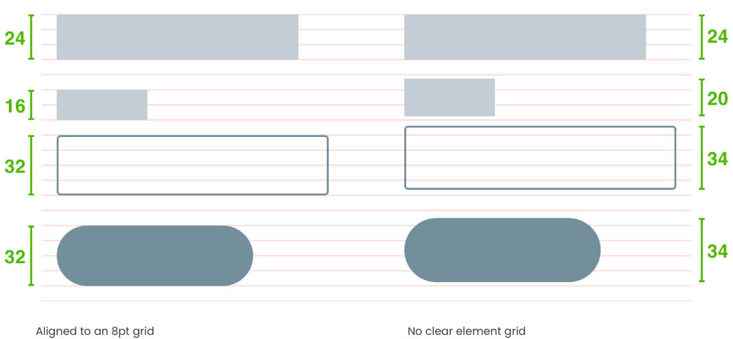
I find using an 8 point grid system very useful. Essentially, it's using multiples of 8 to define dimensions, padding, and margin of blocks and inline elements. Having this system in place helps create consistency in the designs, especially if multiple designers are working on the project.
Why 8? Utilising an even number to size and space elements makes scaling for a wide variety of devices easy and consistent. Also, most popular screen sizes are divisible by 8 on at least one axis - usually both. If you want more info, this article is worth a read!
- For Designers: Efficiency, less decisions to make while maintaining a quality rhythm between your elements.
- For Teams: An easy system of communication between designers and developers (no fussing over pixels). A developer can easily eyeball an 8pt increment instead of having to measure each time.
- For Users: A consistent, clean UI. No blurry half-pixel offsets on their preferred device or weird looking checkouts.
Visual Research, Concepts & Iterations
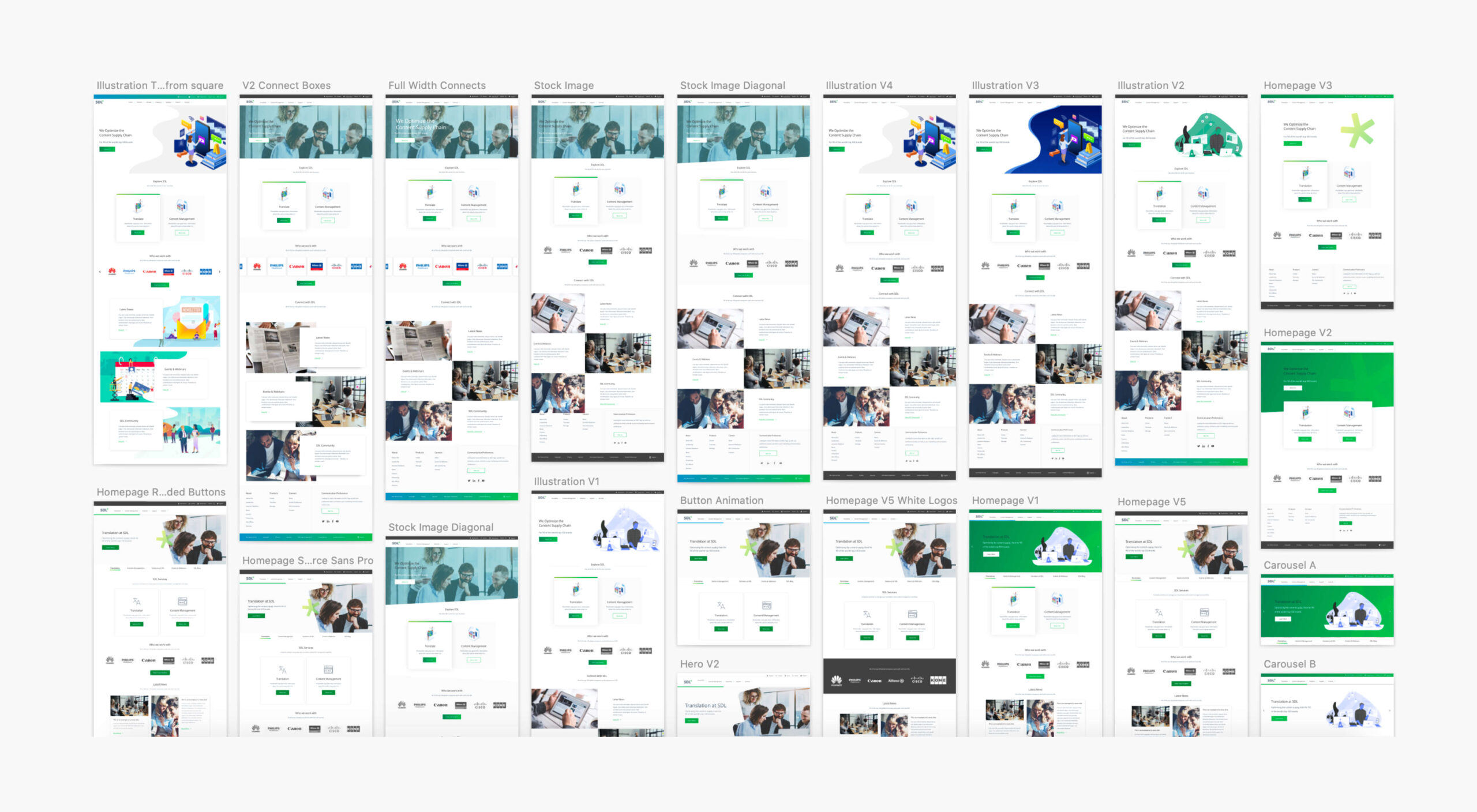
Before getting started on the visual design, myself and a junior designer did some research and created some moodboards based on what the client had provided and what we thought would work. We then began to conceptualise our ideas by mocking up a few initial page templates and component designs.
The client wasn't sure on the direction they wanted to go down, so we produced numerous concepts; some using illustration, some using photography and a concept just using flat colour.
Re-usable & Scalable Components
Once the client had signed off on a style, we could then move on to designing the components.
In essence, Component Based Design is the practice of splitting UI into smaller, more manageable parts with clear names. As we were designing for a CMS, i decided this would be best for this project. Based on the principles of Atomic Design, I wanted to create a set of re-usable components which worked harmoniously together, on any type of page template.
The components would be defined at the start and used throughout the project. After the product had shipped, the client would be creating their own page templates, so it was important to get these foundations right.
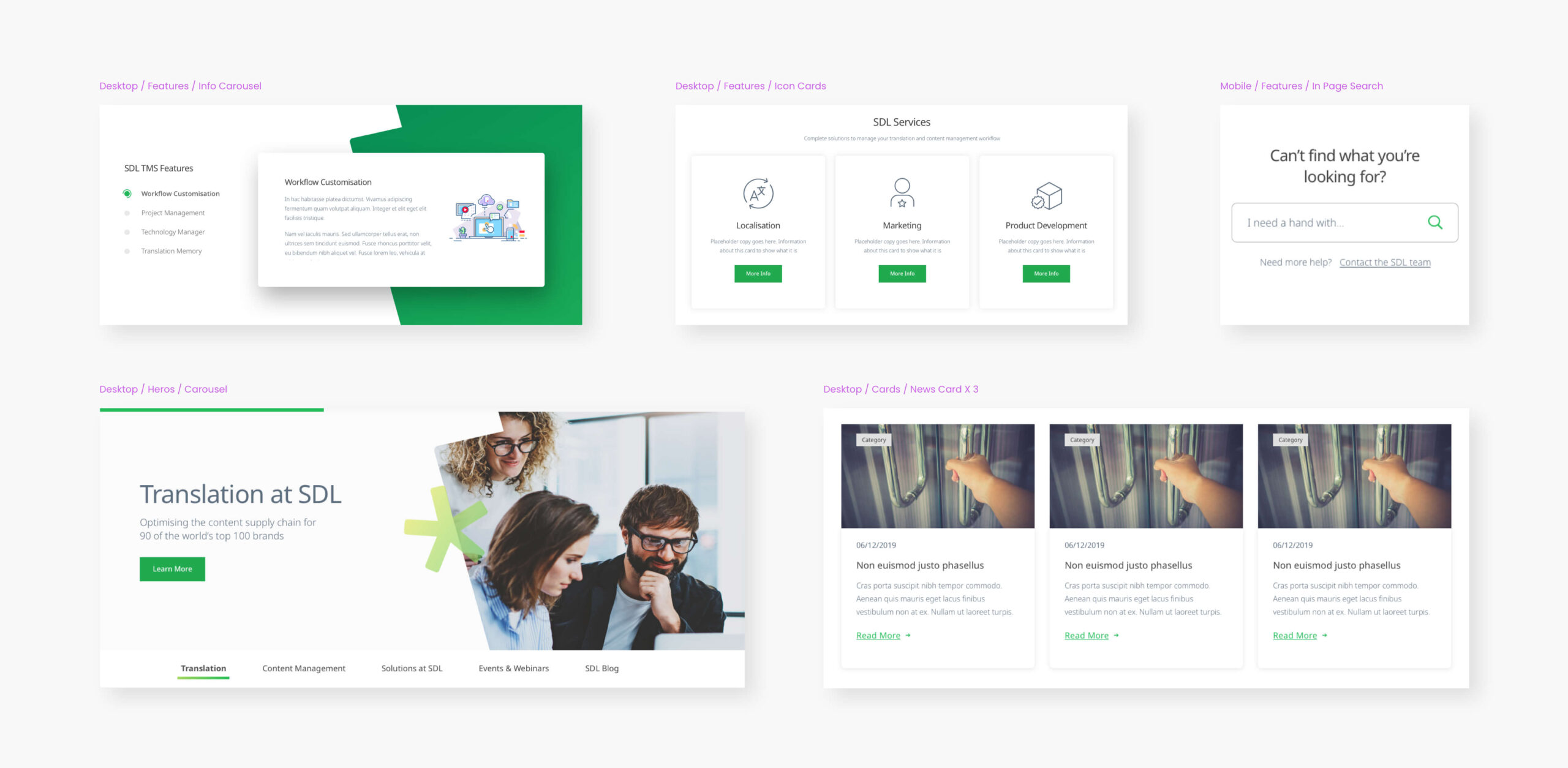
Below are some examples of the components I created
Final Designs & Page Templates
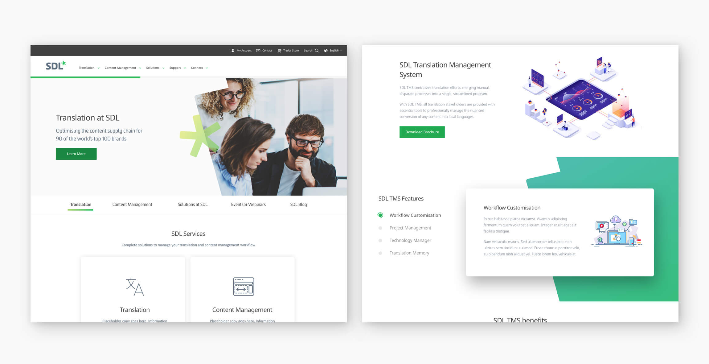
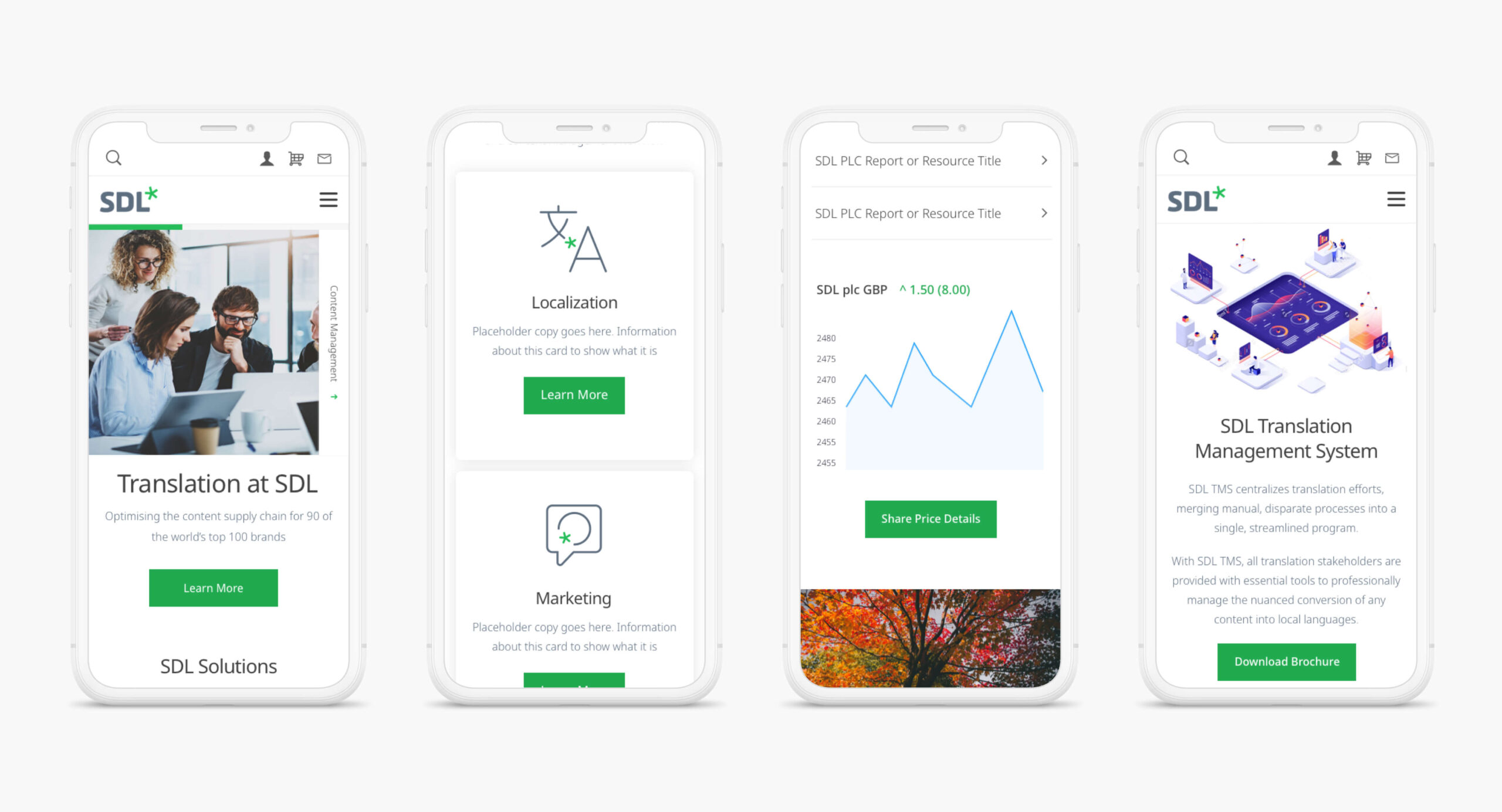
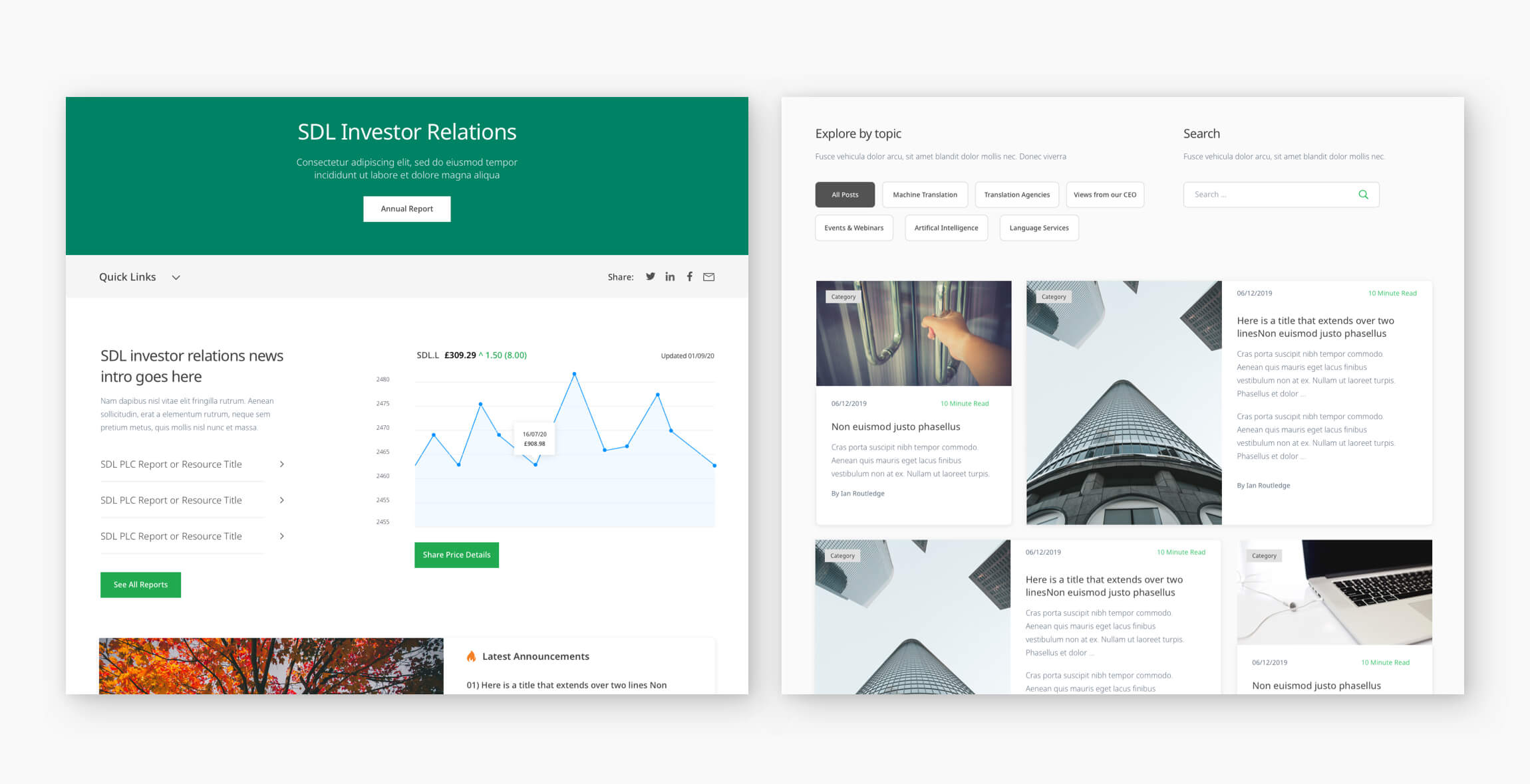
Once all components had been designed, I began putting together some page templates to give the client a better idea of how the site would look. I also created a prototype of key customer journeys, which I found enabled them to visualise things a lot better than flat designs.
Micro-Interactions & Animation
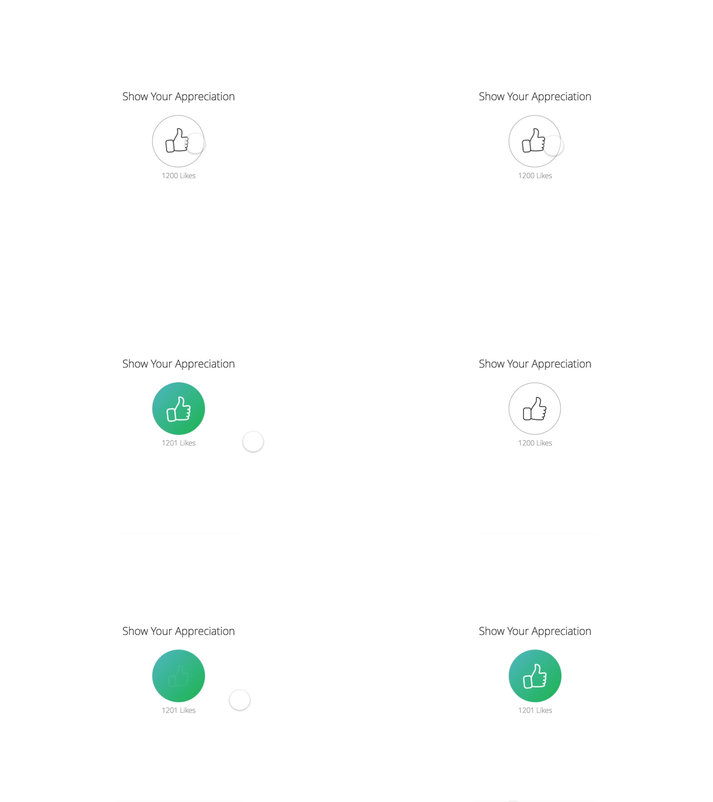
One of the last things i looked at was how we could incorporate micro-interactions and animations to the designs, to really bring them to life. I didn't just create these on a whim; whilst I was designing the components I had a lot of ideas in the back of my mind about how they would work. Afterall, animations and micro-interactions should only be used if they are meaningful and serve a purpose. You can see a couple of examples below ??

Saving GP ResourceProduct Design
Transforming Consumer HealthcareProduct Design
Digital InclusionService Design
Jotun DecoProduct Design
SDLVisual Design

JCB.comProduct Design