The Challenge
Jotun is one of the biggest paint manufacturers in the world, with a presence in over 100 countries. Our task was to completely re-define their current experience for their B2C site, to reinforce the Jotun quality brand reputation and improve the overall user experience.This involved everything from restructuring the IA to providing a new visual direction for the brand.
The Design Process
As with most large scale projects, we followed a fairly standard design process as outlined below. Not only does this give users an intuitive and pleasurable experience - it gives us designers an opportunity to iterate and improve our designs based on real user feedback - which is always a good thing!

The Discovery Phase
This phase allowed us to gain an understanding of both user and business needs, identifying current pain-points, frustrations and goals.
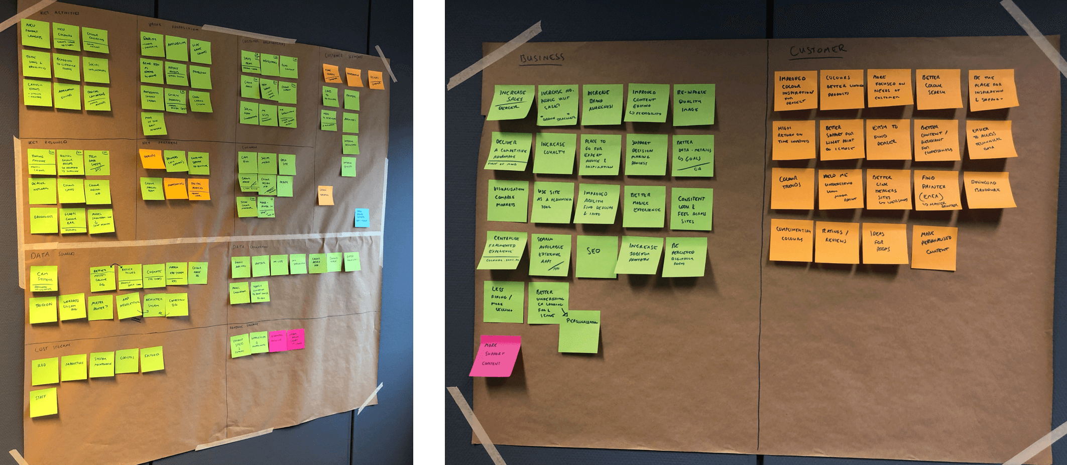
This involved a series of workshops with the client, and the outputs were used to inform my designs. Although I didn't lead these workshops, I worked closely with our Head of UX to gain a better understanding of the client and user needs, as I feel this is extremely important. This included;
- Business model canvas
- Success criteria (Business & users)
- Analytics review
- Competitor analysis
- IA audit
Users and Audience
Along with the workshops, we conducted some quantitative and qualitative research to gain an even better understanding of our users and their frustrations. This included;
- Surveys - we asked users to complete a survey to understand their thoughts on the experience. We wanted to know why they were using it and understand their needs and motivations.
- Heatmaps - to see how users were interacting with the site
- Analytics review - we used GA to gather data which told us how people were using the site
Some examples of what the current users said were;
"We are doing some renovations and looking for ideas. Our friend mentioned Jotun, but when we went to the site, we couldn't find what we were looking for. I ended up trying somewhere else"
"Website feels dated and difficult to use"
"I dont understand what the website is for, it's got a picture of furniture, a ship and an airport. very confusing."
On reflection, it would have been beneficial to have done some more in-depth interviews with real users and potentially some lab testing, however this wasn't possible due to time constraints and budget.
Our Key Findings & Vision
- The current experience is very outdated compared to competitor offerings
- The main goal for the site is to drive consumers to products and dealers
- Users want a better experience focusing on colour and inspiration
- The current experience doesn't focus around leads or conversion
- There is no connection between colours and inspiration
- Search functionality is not intuitive and does not present accurate results
Our aim was to provide an experience which encompasses and aligns both user and business goals. Giving users an elegant experience which is intuitive and inspiring, whilst ultimately generating leads and sales for the business
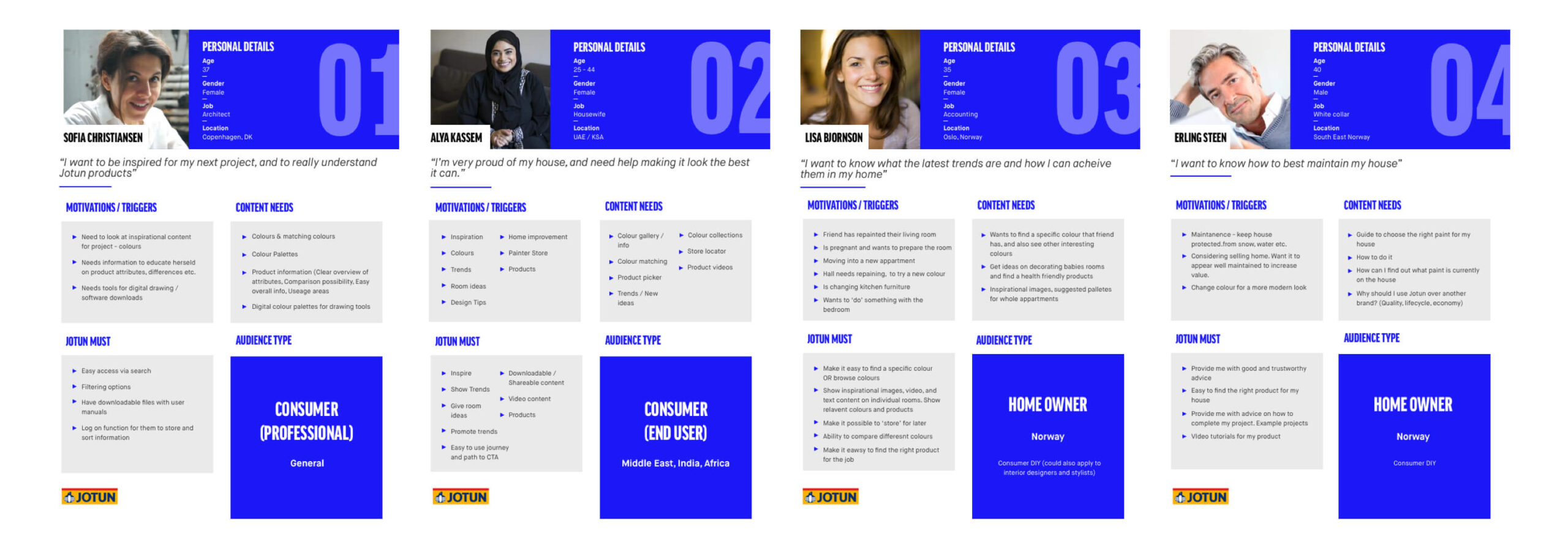
Proto-Personas
I worked with various Jotun stakeholders and used our research to update the Jotun personas. These would be used throughout the project to validate design decisions and also inform the user journeys.
Information Architecture
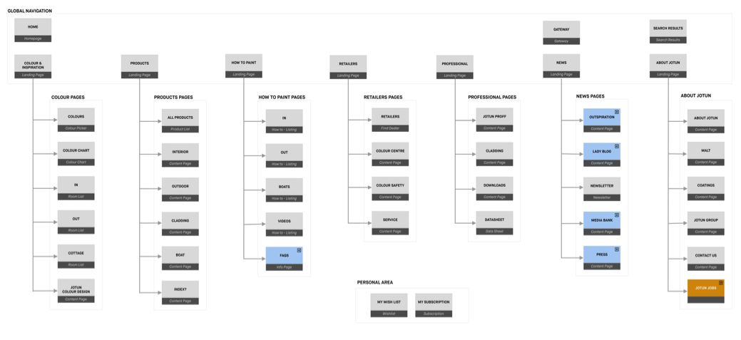
Next, using the research we had already collected and what we knew about the users, we looked at restructuring the IA to improve the customer journeys. From research, we knew that users were mainly interested in Colour and Inspiration, so we made these a key focus of the new experience. From a business perspective, Jotun wanted to drive users to their Product Pages, so it was important that each journey aligned.
Once we had agreed on the new IA, we looked at doing some Tree Testing to validate our decisions.
Key User Journeys
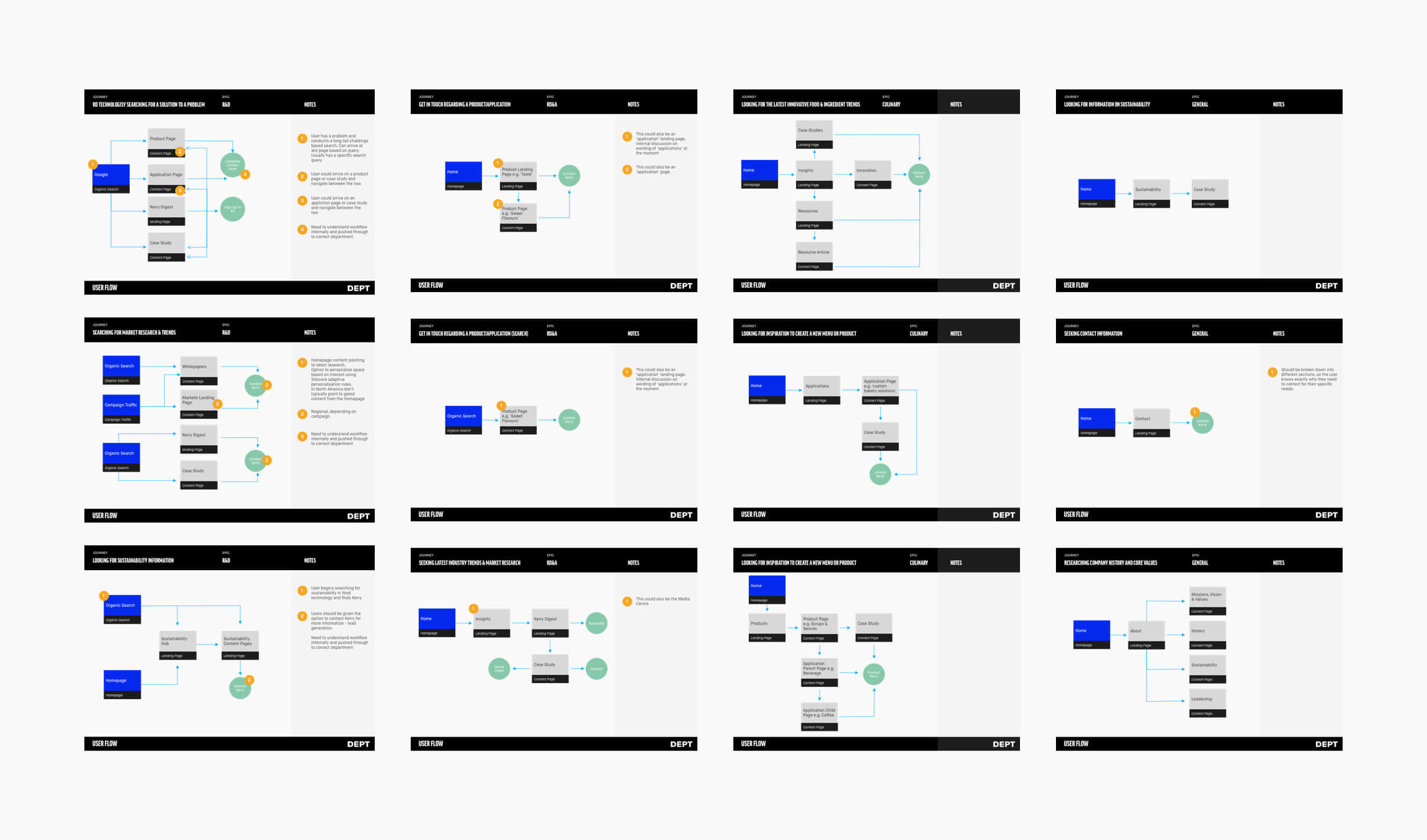
Once we had defined the new sitemap, I looked at improving the key user journeys. On the old site, users were confused and couldn't complete their tasks easily. I wanted to completely remove any frustrations, creating an experience which is not only intuitive and easy to use, but enjoyable.
The Define Phase / Ideation
When the discovery phase was complete, I broke the project down into 5 sprints, each focusing on a seperate stage of the journey. I arranged a weekly call with the client to discuss each sprint and run them through a prototype. This meant we were able to deal with any feedback or changes much more efficiently.
This deliverables from this phase included;
- Initial sketches & concepts - (these are no more unfortunately ?)
- Wireframes
- Prototypes
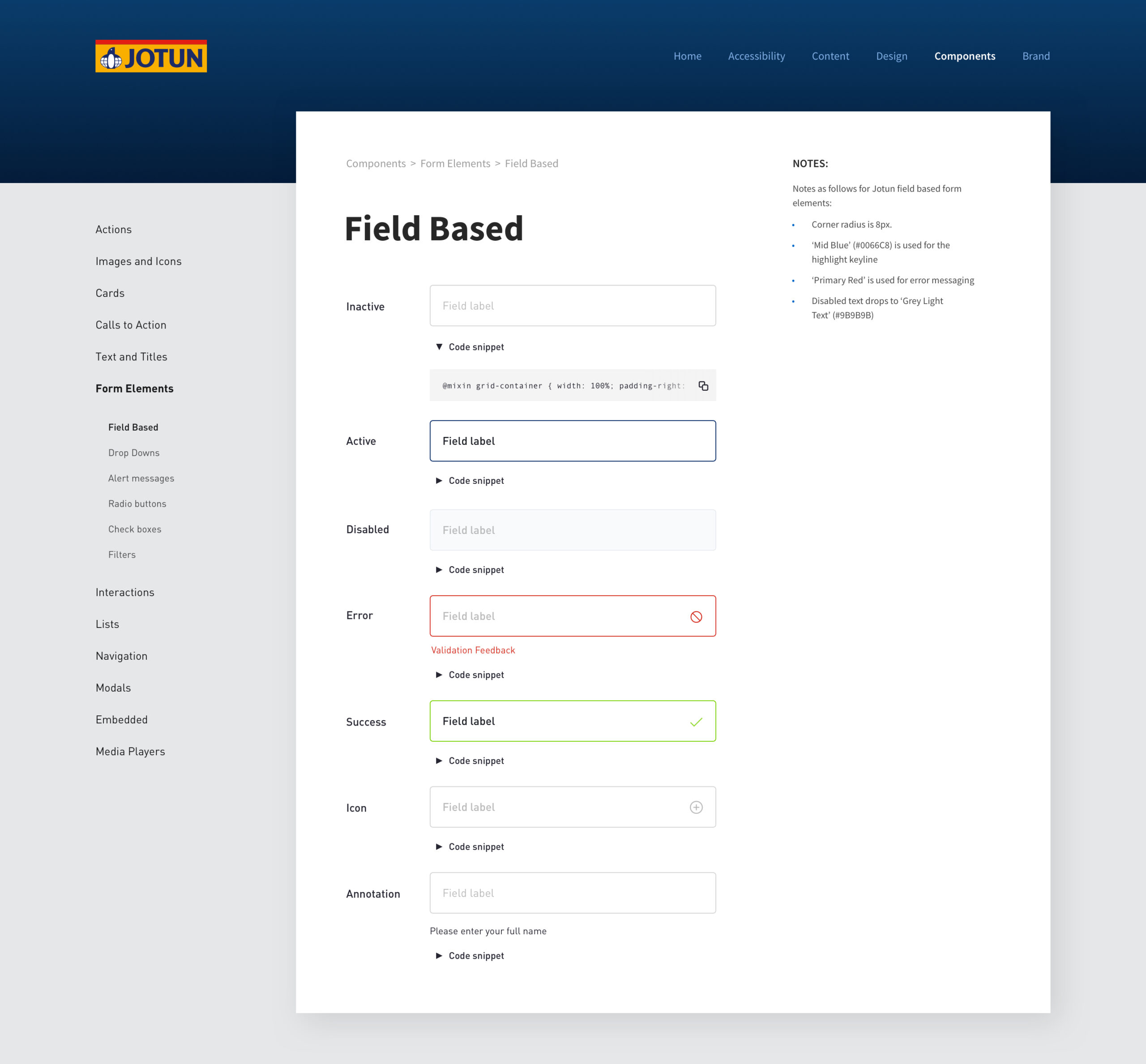
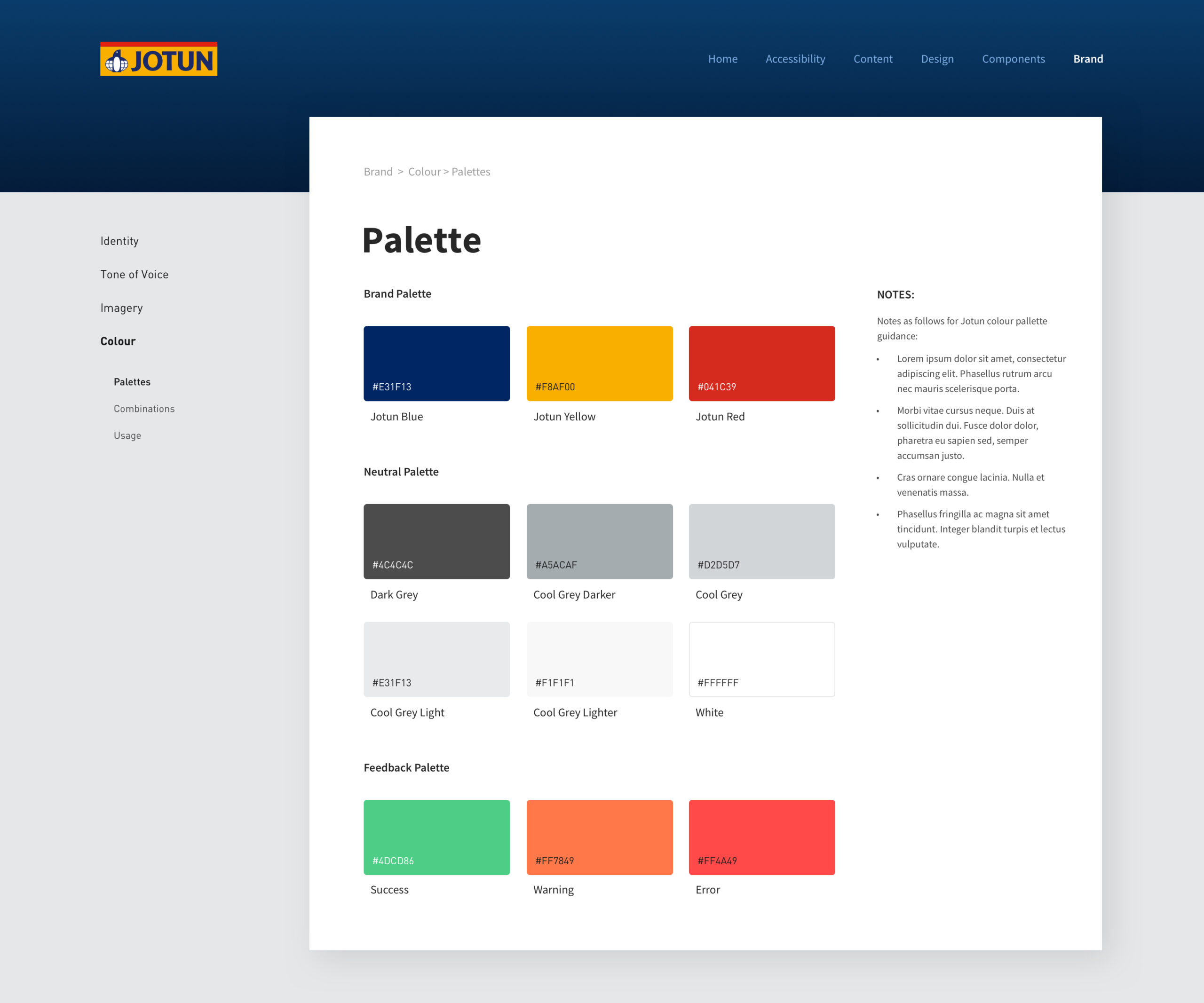
- Styleguide
- Visual Design
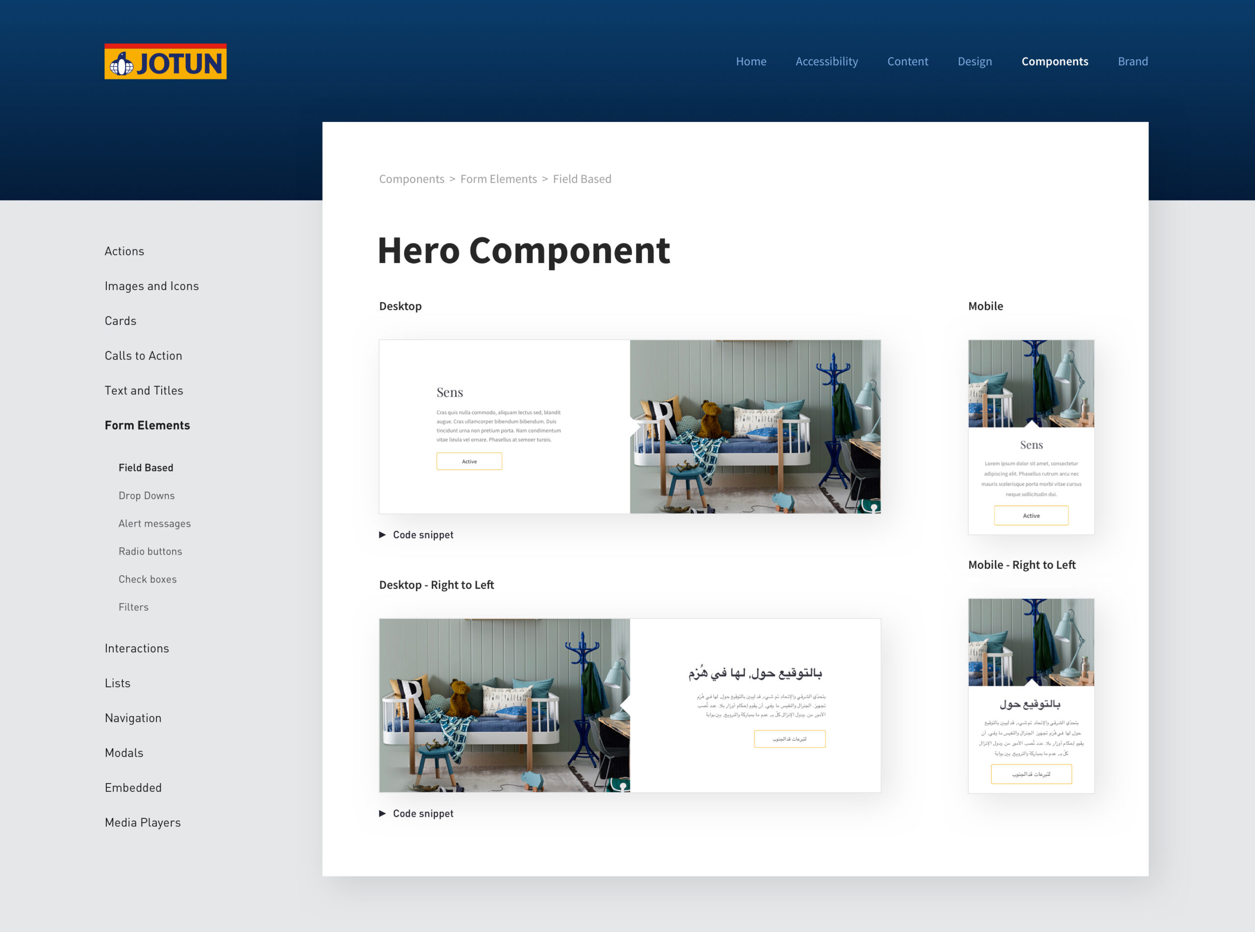
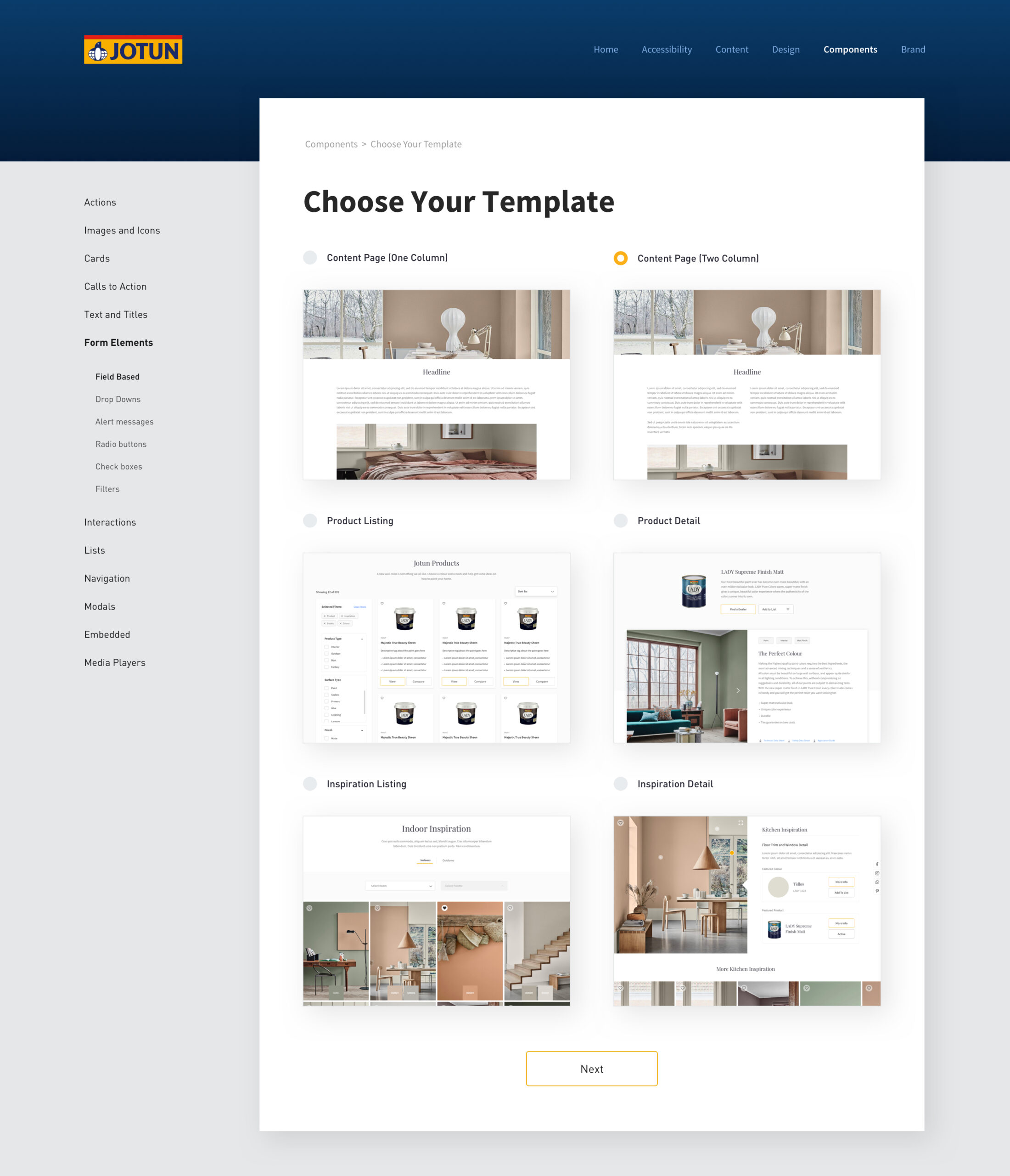
- Component Library
Usability Testing
It's important to get feedback and validate any design decisions as early on in the process as possible. That way, any problems can be ironed out before it reaches the build stage, which would be much more costly to implement any changes. Our researcher conducted some remote testing to validate my designs.
Real user feedback is also a great way to settle internal (or client) disputes. Also, very often as a designer it's easy to fall into a trap where your work maybe influenced by cognitive bias. Asking users what they think can eliminate this, ultimately providing them with a better experience.
Once we collected the research, I used the findings to improve the designs and iron out any pain points. Once we had an MVP, the plan was to conduct more research and adapt a test and learn approach.
Previous Jotun Experience
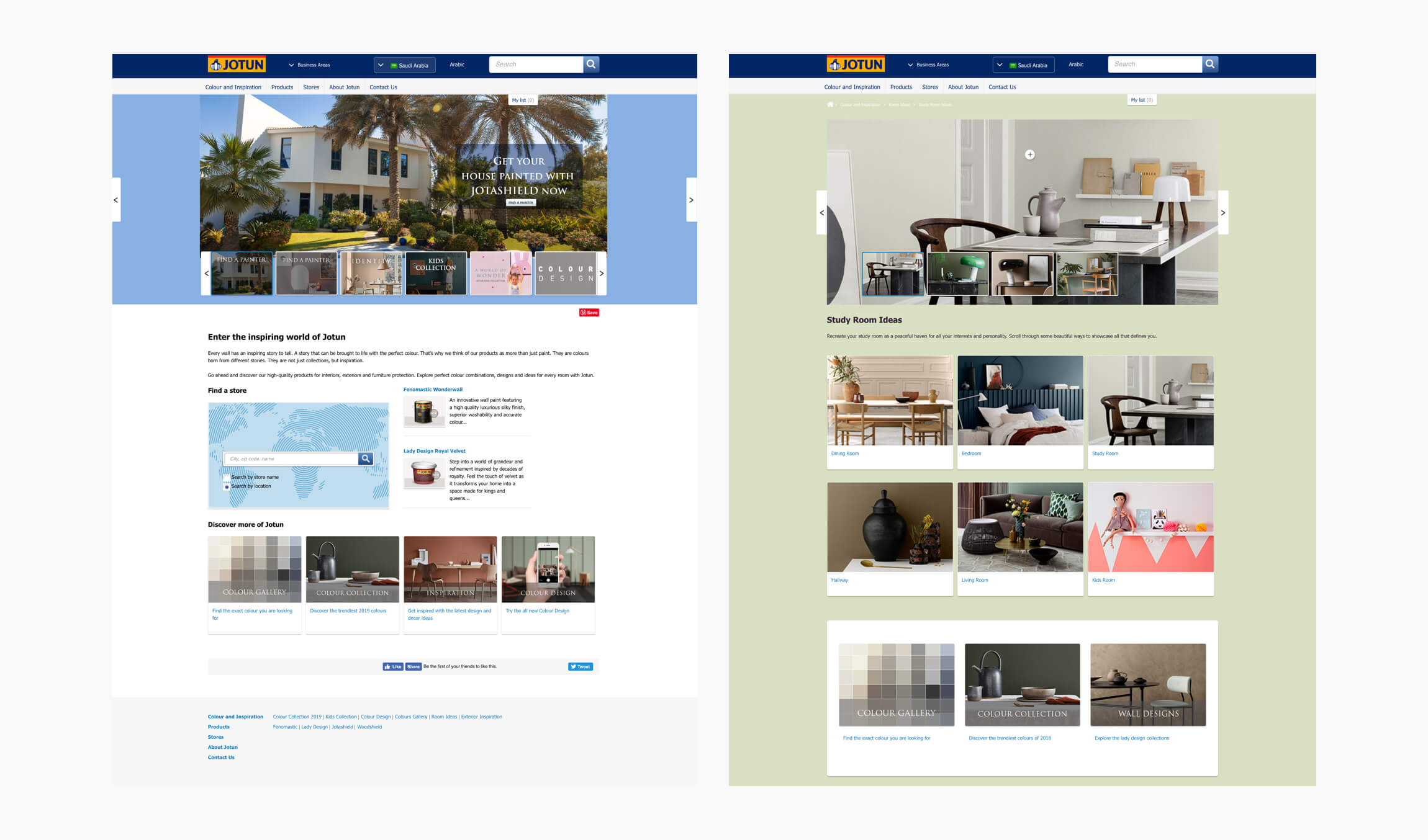
As you can see below, the original Jotun experience was far from inspiring and didn't convey the elegant, luxury feel which Jotun required. Following a 960px grid, the site was very dated and needed a complete overhaul.
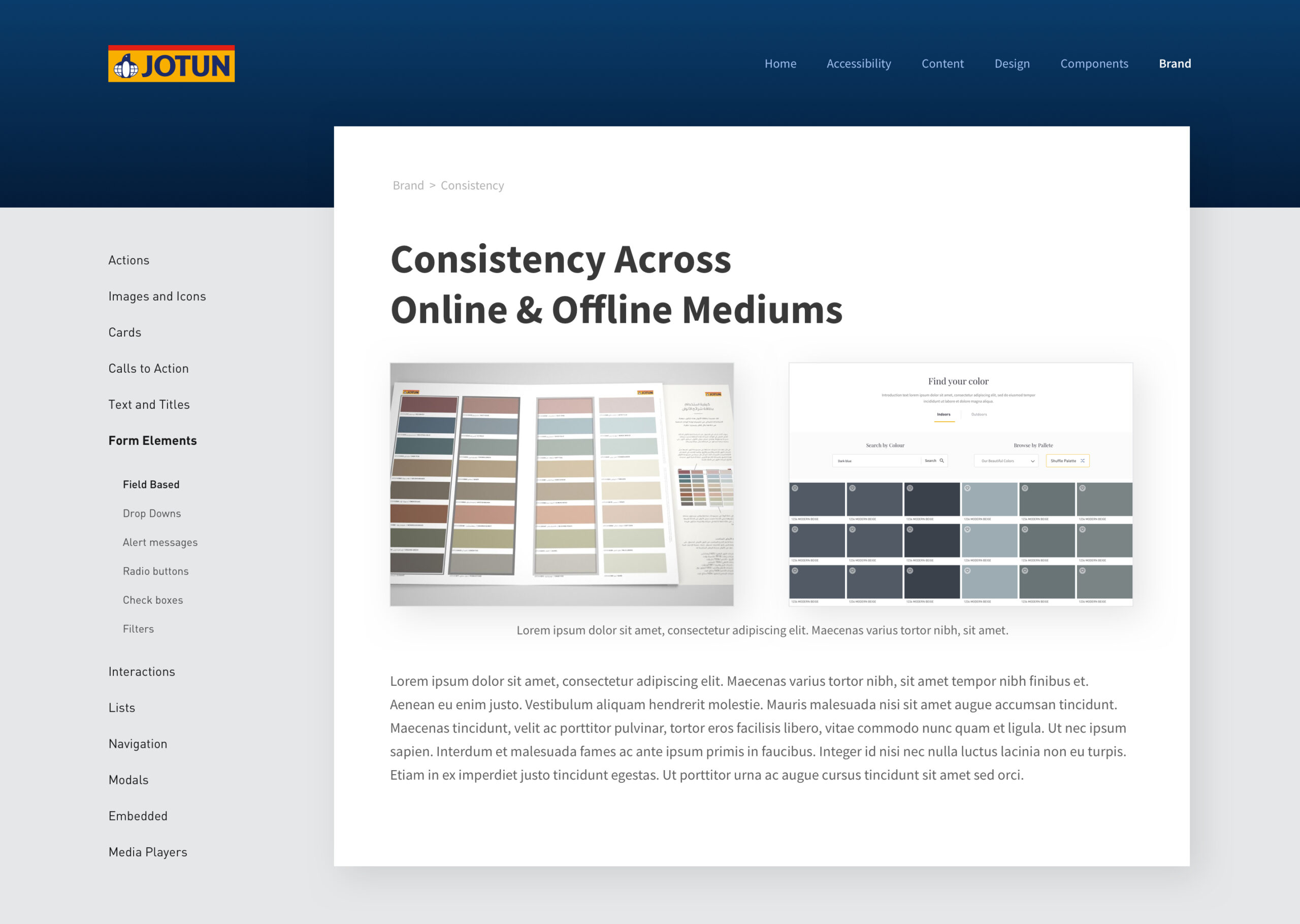
Creating a strong brand identity
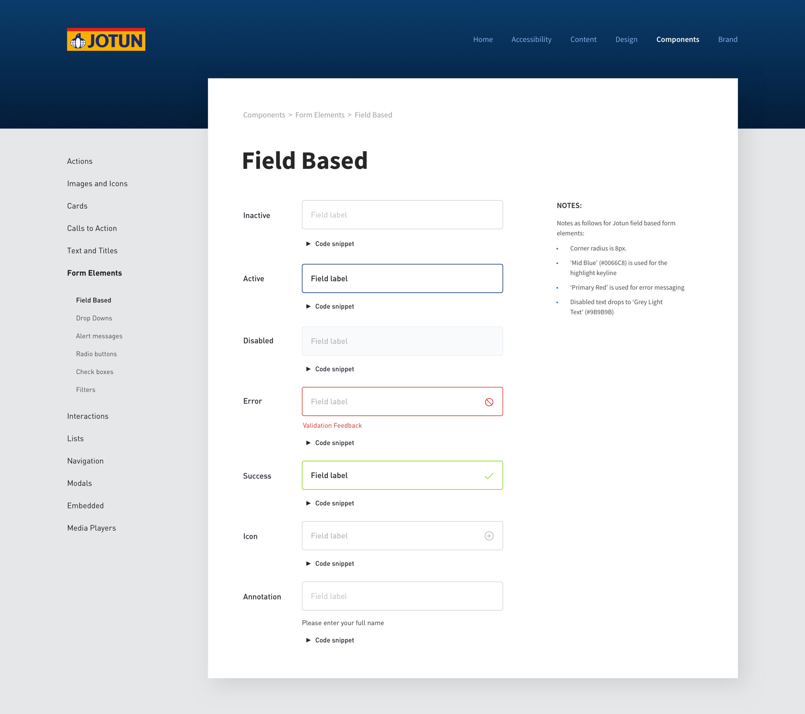
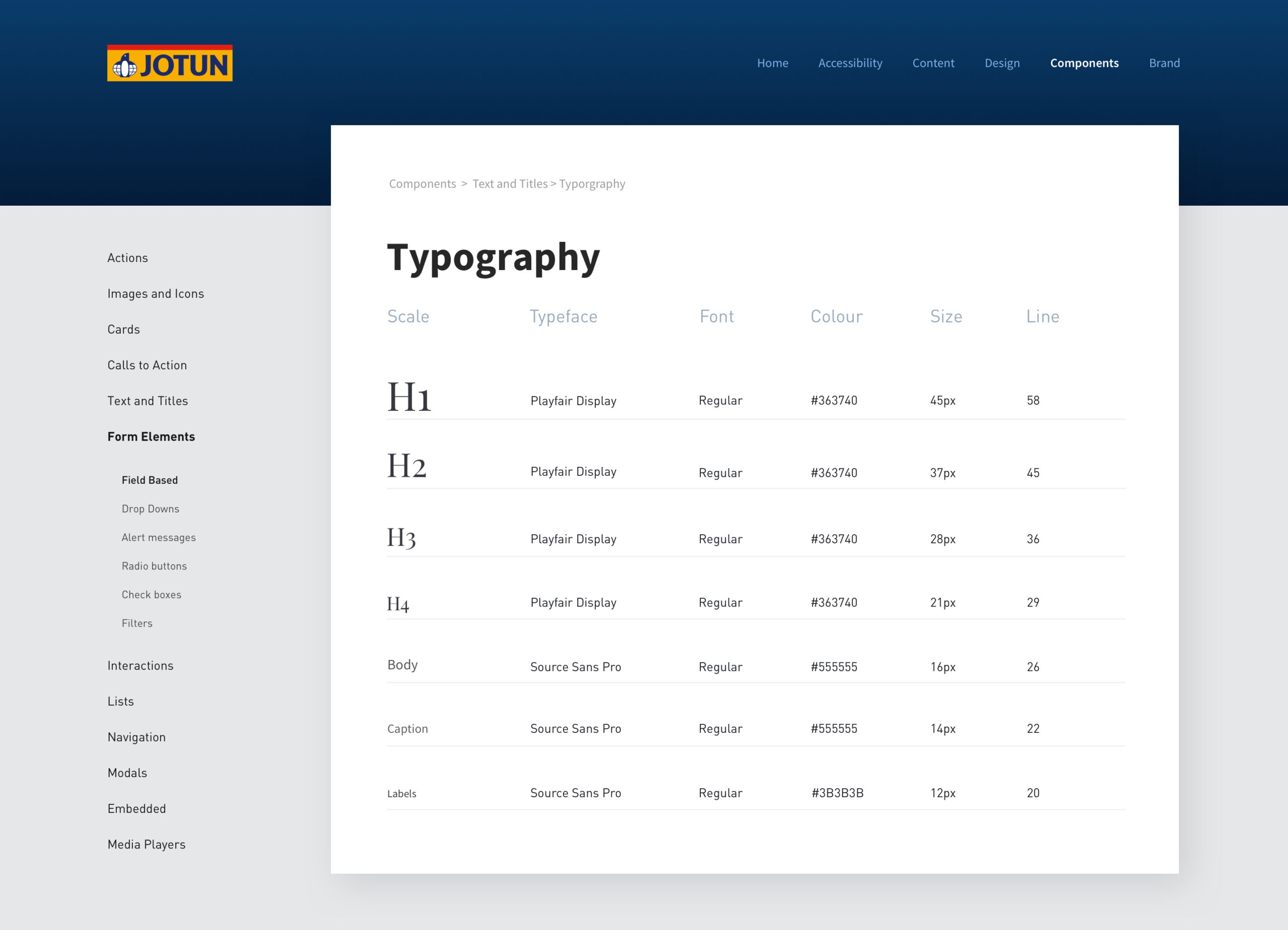
Once the wireframes had been signed off by the client, I began to work on refreshing the brand's visual identity, creating a styleguide and component library.
One of the biggest challenges here was finding a suitable typeface to compliment the brand. With Jotun being such a huge company, there were a lot of different stakeholders to please. Also, with Jotun being a multi-language website, I had to find a typeface which would support most languages.
Another challenge was that the website would need to function in Arabic, this meant that everything would be flipped from right to left. With Arabic, the right-to-left aspect is more complex because the entire web page needs to be flipped horizontally. A lot of time was spent making Arabic typography fully functional across all devices, given the poor support for Arabic fonts online.
Inspiration Pages
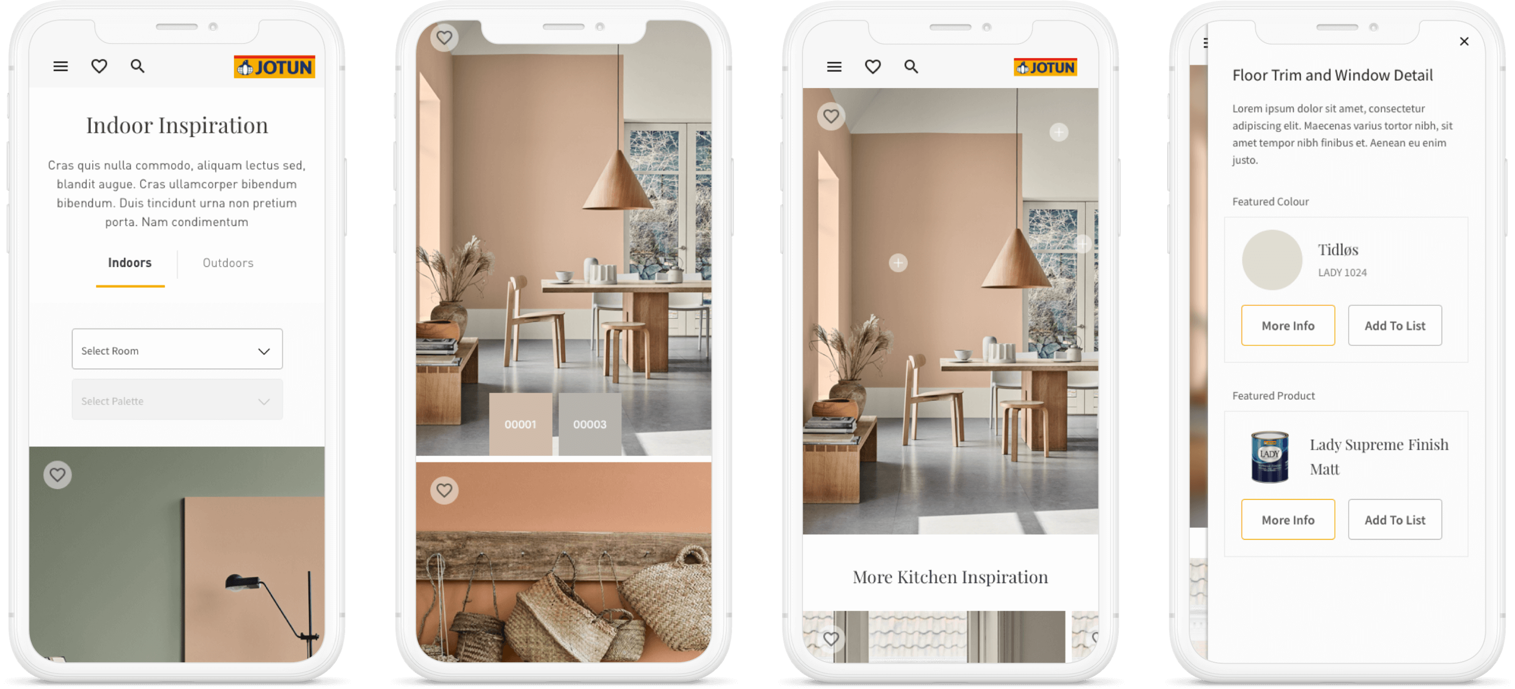
We found that a large majority of users were coming to the site to look for inspiration. Jotun also produce thousands of inspirational images each month, so I was able to allow the user to filter these down by room and colour. This enabled them to filter out any content that may not be relevant to their needs.
Product Listing & Display Pages
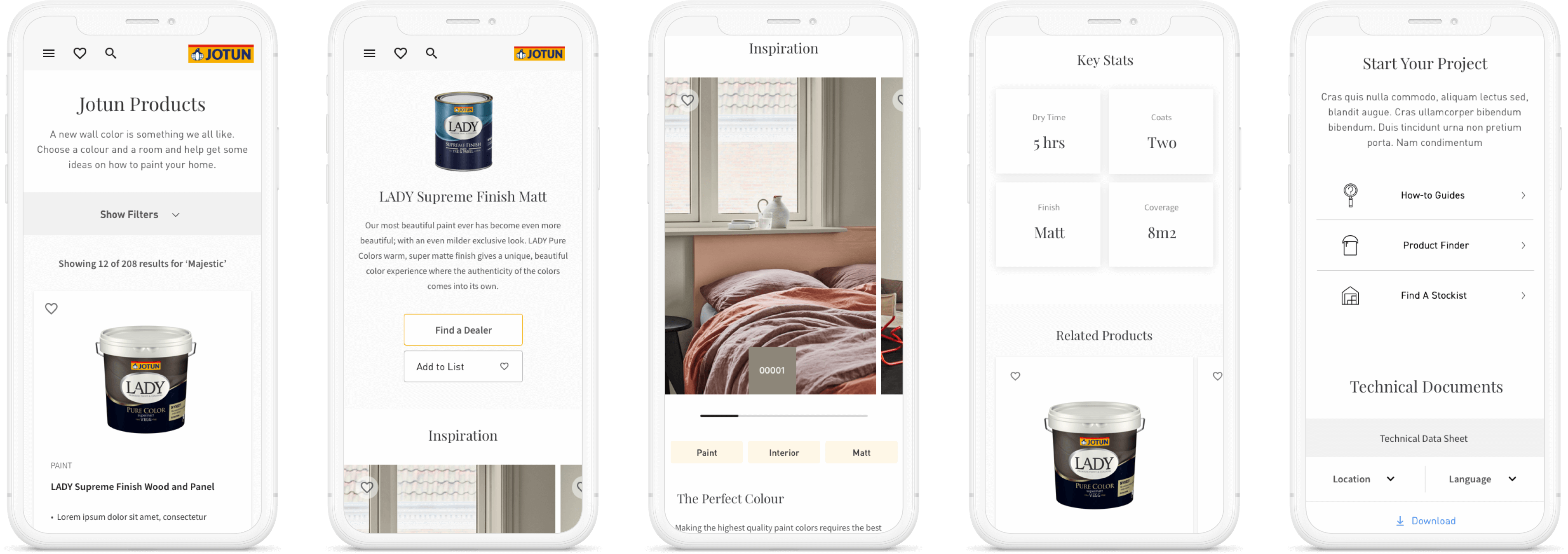
On the colour pages, users are shown which products are available in that colour. The next step would be to click through to the product display page. This page tells the user everything they need to know about the product, and also shows inspirational images using that product. Research showed us that the most important info users looked for were dry time, number of coats, finish and coverage, so I decided to pull these stats out and display them clearly.
Prototyping
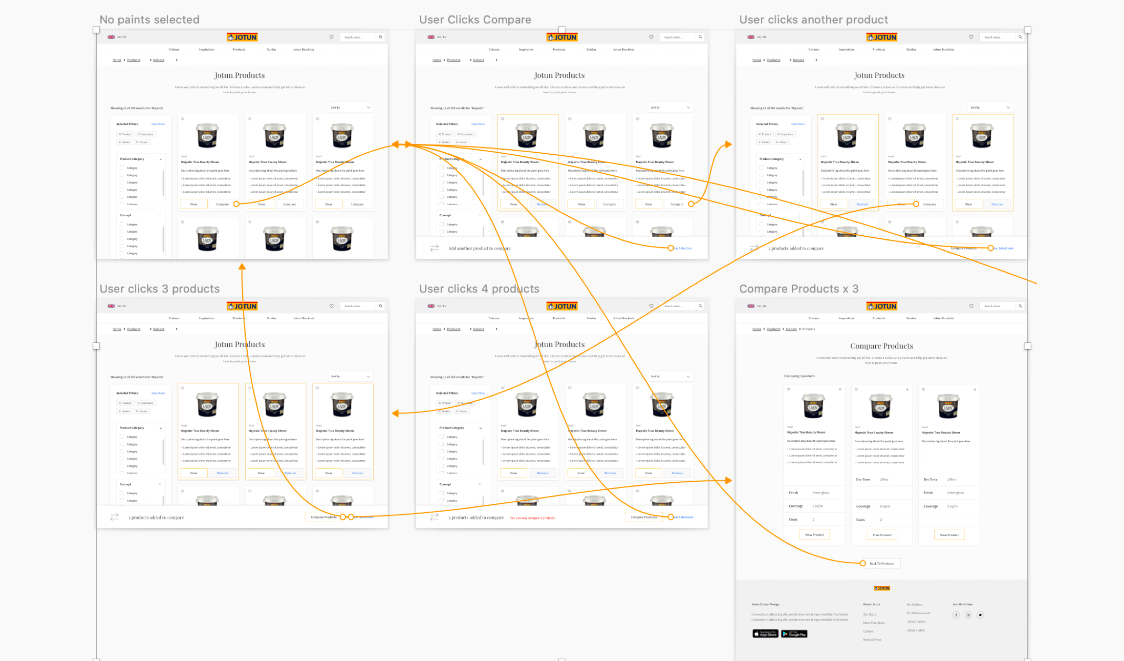
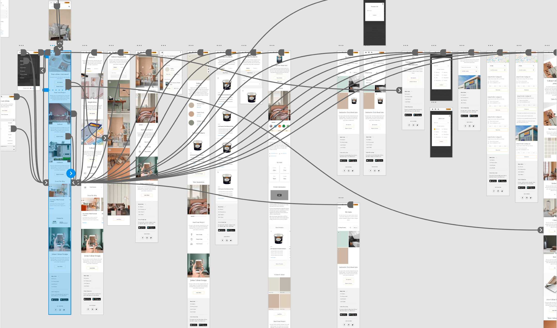
As part of the deliverables, I provided the client with prototypes at multiple stages of the project. I wanted to prototype each sprint, to give them a better understanding of how the functionality would work. It also helped them visualise the different user journeys. At the end of the project, I made a high fidelity prototype of both the desktop and mobile experience, which was sent to the CEO of the company for approval.
The Results
Overall, I really enjoyed working on this project as I was involved in the full end-to-end process. I learnt a lot about the importance of the discovery phase and how this informs all design decisions.
As we had already defined what success looked like at the beginning of the project, it was easy for us to analyse the results to see if we had achived what we set out to do.
Business success;
- Increase in traffic
- Increased sales and lead generation
- Created a consistent, fully responsive experience
- Re-inforced Jotun as the place to go for insipiration and expert advice
What the users said:
"wow! The new site looks amazing and very modern. Love the images!"
"I came looking for a specific paint and ended up wanting to redesign our whole house :D"
"Such an improved experience. Easy to navigate and find what you're looking for. Feels like pinterest"
This project also allowed me to develop my communication skills. With Jotun being a huge multi national company, I was dealing with a lot of stakeholders at different levels and different countries. Although challenging at times, it was good to be pushed out of my comfort zone and the client were extremely happy with the results.
Next Steps - Creating & Implementing a Design System
The next step in this project is to deliver a full scale design system which will function accross all digital touch points. This includes the B2C site, B2B site and Customer Portal.

Saving GP ResourceProduct Design
Transforming Consumer HealthcareProduct Design
Digital InclusionService Design
Jotun DecoProduct Design
SDLVisual Design

JCB.comProduct Design
